A powerful tool that felt frustrating to use.
Shutterfly's Photobook Editor is feature-rich — but creating a book often felt overwhelming. Key actions weren't easy to find or understand, which led to extra searching, trial-and-error, and uncertainty about whether the final product would look right when printed.
We initially scoped the project around Shutterfly's autofill feature. But early research revealed something broader: the friction wasn't isolated to one feature. Confusing labels, unclear visual hierarchy, and limited user control were creating compounding problems throughout the entire editing workflow.
Recognizing that fixing just autofill wouldn't meaningfully improve the experience, we made the call to redesign the editor more holistically — targeting the structural issues our research had surfaced.
"I have no idea what page I am on… no clue."
— Participant 6, think-aloud session
Participant 6 lost track of their page mid-task — the editor offered no visible "you are here" indicator.
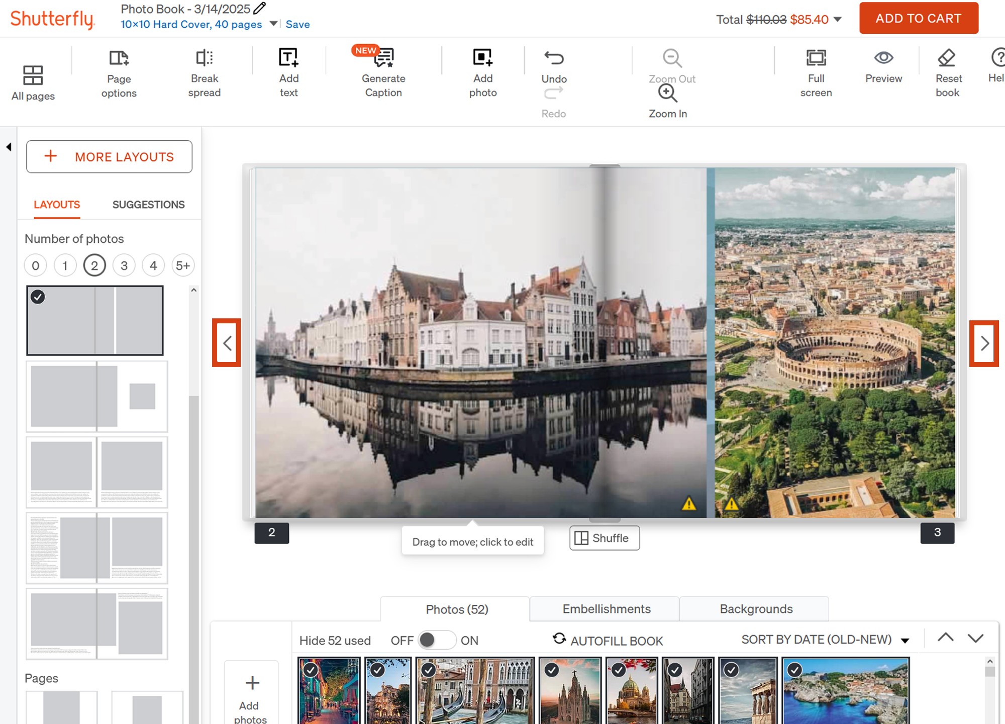
The left and right page-flip arrows flanking the canvas went unnoticed by most participants.
Where the editor was breaking down.
We used three complementary methods to build a precise picture of the problems — each one surfacing a different layer of the experience.
Think-aloud sessions with 8 participants completing key editing tasks while verbalizing their experience gave us direct access to moments of confusion, hesitation, and frustration as they happened — not reconstructed after the fact.
A cognitive walkthrough let us move through the flow as a user would, from starting a book to editing and previewing. Three recurring issues emerged: confusing labels, lack of clear hierarchy, and limited user control that forced workarounds.
Finally, quantitative benchmark testing in Maze gave us a standardized baseline. The existing editor scored 59 on the System Usability Scale — a marginal score that confirmed the interface wasn't meeting basic usability standards, and gave us a number to measure improvement against.
Measured before any redesign work began. The editor failed to meet basic usability standards across all three indicators — confirming the need for structural changes, not surface-level fixes.
Users didn't know to select the correct page before looking for layouts — page options were hidden under the spread layout options, so clicks scattered across the wrong panel entirely.
Redesigning for clarity and confidence.
Our redesign addressed four core issues identified in research, each tied directly to a documented pain point.
First, we simplified the top-level toolset — merging overlapping features into clearer categories to reduce the number of choices users face upfront. Fewer decisions at the surface level meant users could focus on the task, not the interface.
Second, we introduced a responsive toolbar that reveals task-specific options contextually. Rather than showing every possible action at once, the toolbar adapts to what the user is currently working on — reducing cognitive load by surfacing only what's relevant in the moment.
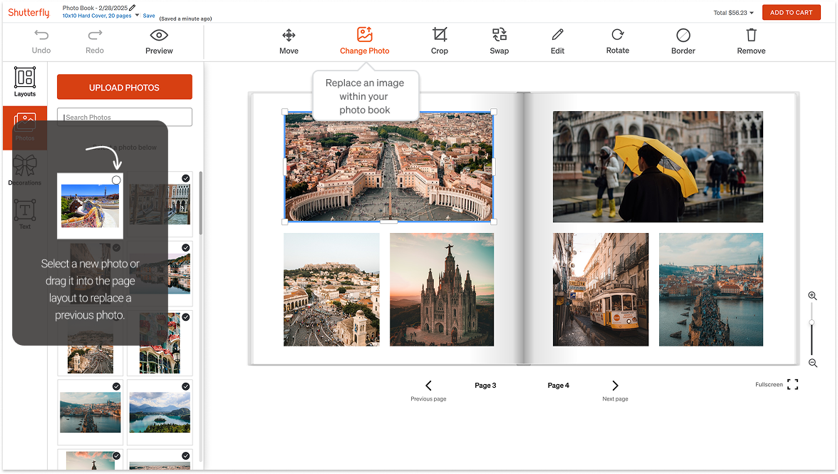
Third, we made the photo panel more prominent and added a distinct "Change Photo" action, clearly separated from "Swap Photo" with explicit labels and visual differentiation. This resolved the most frequently observed confusion from our sessions.
Finally, we built a centralized navigation element for the editor's main capabilities — Layouts, Photos, Embellishments — so users could form a reliable mental model of what was available and where to find it, without exploration or guesswork.
Simplified toolset with clear categories
Merged overlapping tools into cleaner groupings so users face fewer decisions at the top level, reducing the cognitive overhead before they even start editing.
Responsive, context-aware toolbar
The toolbar now reveals only task-relevant options based on what the user is actively working on — showing less, surfacing more of what matters.
Distinct "Change Photo" action
Separated from "Swap Photo" with a dedicated label and position in the toolbar — eliminating the most commonly observed point of confusion in think-aloud sessions.
Centralized editor navigation
A persistent nav element surfaces the editor's main capabilities — Layouts, Photos, Embellishments — so users form a mental model without needing to explore or guess.
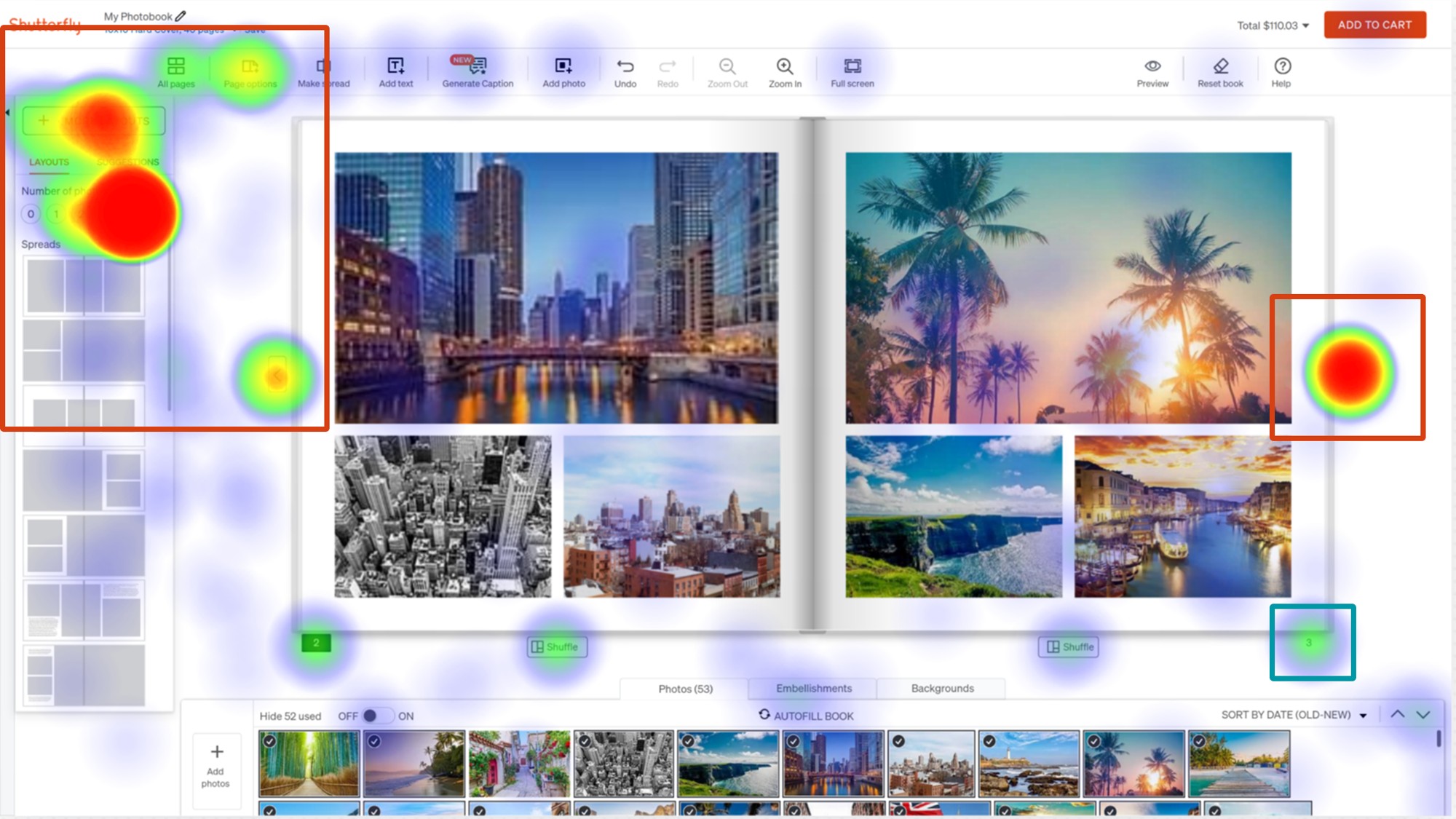
Before and after — the dense, always-on toolbar of the original editor versus the simplified toolset and persistent side navigation of the redesign.
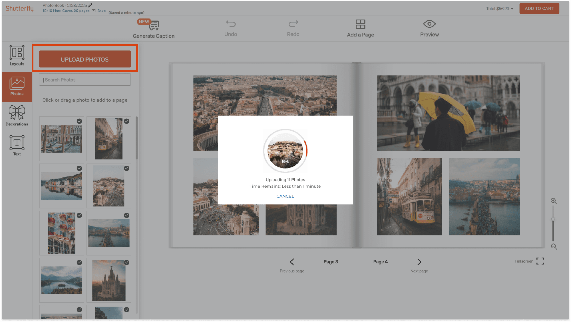
The redesigned upload flow — "Upload Photos" finally carries the visual weight of a primary action, with clear progress feedback while photos import.
Every metric moved. The worst flows moved the most.
We re-ran the same three benchmark tasks on the redesigned prototype in Maze. The biggest gains landed exactly where research had flagged the worst friction: Change Photo task success jumped from 52.6% to 90.5%, first-click accuracy on decorations doubled from 45.5% to 90.5%, and user confidence on the layout task rose from 2.4 to 4.2 out of 5.
The redesign addressed the four main pain points through centralized navigation, clarified action labels, a more responsive interface structure, and improved visual hierarchy for the photo upload flow. Users completed core tasks with less searching and more confidence in what they were doing.
The same three tasks, tested before and after. Where the baseline was already strong (Find Decorations success), the redesign held it — while fixing the first-click confusion underneath it.
Change Layout
Change Photo
Find Decorations
Beyond the redesign itself, we delivered a set of future recommendations for the client: onboarding tutorials for complex editing actions, consistent tooltips throughout the editor, AI-assisted layout suggestions, and photo enhancement features — all grounded in patterns we observed during research.
Introduce short tutorials to explain complex editing actions the first time a user encounters them.
Uniformly provide tooltips throughout the editor so no control requires guessing.
What I took away.
This project reinforced how important it is to validate complex tools with real users — not rely on assumptions about where the friction lives. Our initial scope turned out to be the wrong focus, and it was early research that gave us the evidence to redirect. That pivot made the final work significantly more impactful.
Working within an existing product structure also pushed me to design changes that felt native and coherent rather than like an overlay. The constraint of not being able to overhaul the editor's fundamental architecture forced more precise, targeted thinking — which is closer to what real product work actually looks like.
One honest challenge: testing constraints meant we had to recreate baseline screens in Figma rather than test the live site, which approximated rather than exactly replicated the production experience. Future iterations would benefit from live-environment testing to close that gap.